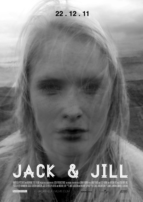
Portrait Poster
I thought it would be good and helpful to my project to create a portrait poster for my film.
I decided that I should add in what I thought was called ‘movie credits’ at the bottom of a poster, after intense research I found it was actually called a ‘billing block’, this website helped a lot when writing my billing block and although I did not stick to the conventional credit order, I did use a lot of the suggestions. I didn’t feel the need to stick to the conventions as after researching other movie billing blocks I noticed they did not either. I wanted to make the billing block feel as authentic as possible and researched what text is used in actual movie posters, apparently there is no specific font used but most companies use Univers 39 Ultra Condensed, I found this out on a web forum and downloaded it off the link on the text. The reason I didn’t use a billing block on my landscape poster was that I felt it over-complicated it and was unnecessary, after experimenting and making sure I kept it neat and simple I thought it fitted well and actually complimented the poster. Creating an authenticity to it that had been vacant before.
Here is my billing block –
In comparison with –
Although mine is thinner, it suits my poster. I feel I have effectively recreated this billing block and made it look realistic and suitable for my poster.
Now for the final poster –
This is my final portrait poster. As you can see, I have kept it simple, need and to two colours. I did this as I felt it fitted with the rest of my work previously, all my work has been minimalistic, hopefully echoing the film.
Colours/Set out decisions explained –
- I decided on a simple black and white theme as I felt it was good to keep the them continuous throughout.
- As a slight obsessive, I made sure all the lines of text matched perfectly. I think this is key to a successful piece of advertising as it creates order in what can potentially be a chaotic production.
- I decided against a quote as I felt the image was more powerful than the landscape poster. The face of the ‘actor’ fills the page, demanding attention.
- The font used for my title of the film was the same used on my landscape poster, I felt this continuity was essential in creating links between posters.


It would be great to see your finished poster. Good luck!